
Matte vs Glossy Canvas Prints: Choose Your Perfect Finish
Key Takeaways
- Matte vs glossy canvas prints differ most in glare, color vibrancy, and perceived depth. Your lighting and image style should guide the choice;
- Pick matte for bright light, portraits, and black and white images. Pick glossy for vivid colors, high contrast scenes, and controlled lighting;
- Semi-gloss or satin finishes offer a balanced middle ground, while metallic finishes add shimmer for modern, dramatic artwork;
- If you want a zero-fuss, damage-free display, Mixtiles photo tiles provide a soft, low-glare look with peel-and-stick or magnetic mounting.
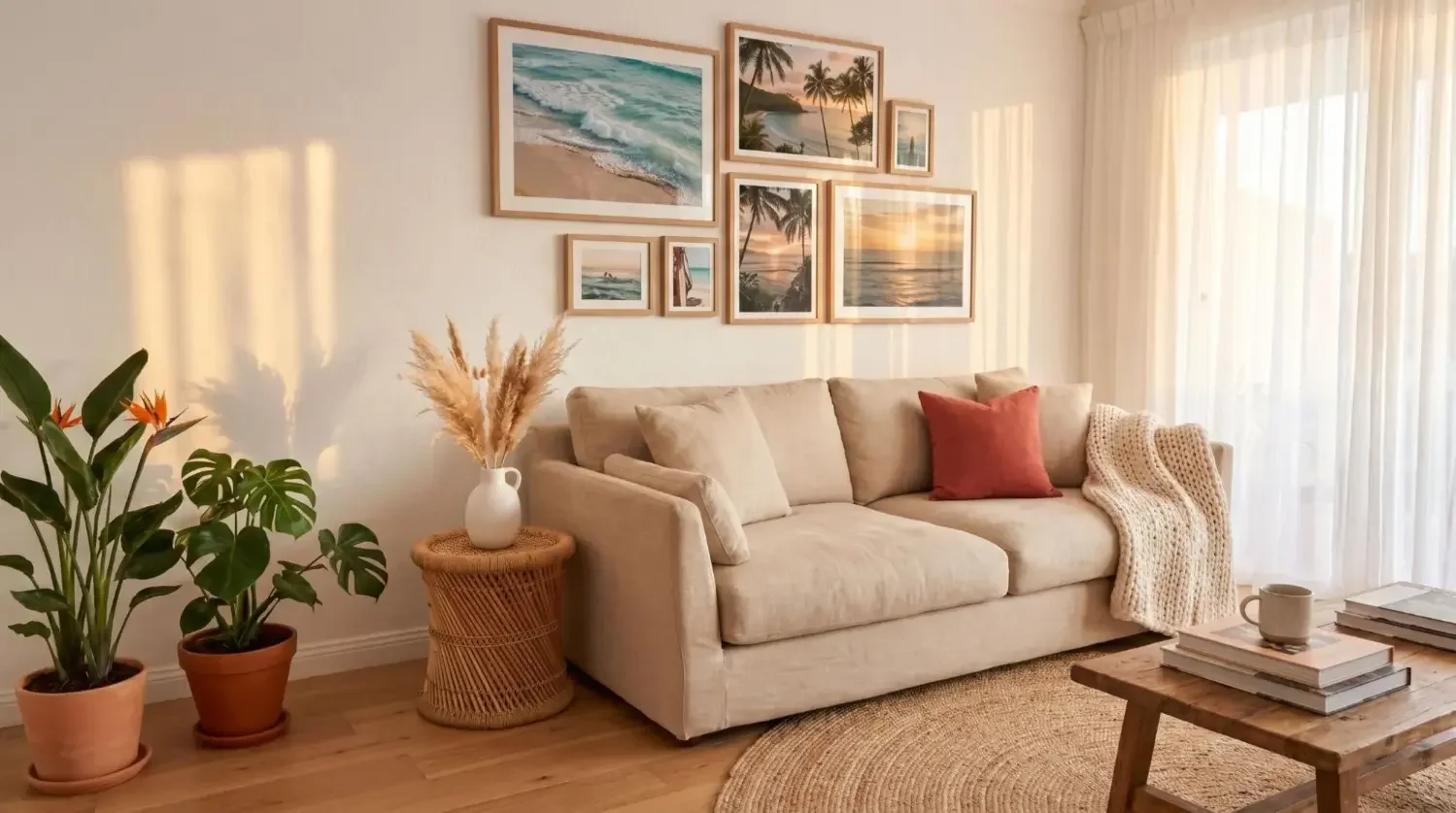
Comparing matte vs glossy canvas prints can feel tricky because both can look beautiful, only in different ways. Glossy finishes boost color and contrast for a striking, modern look. Matte finishes reduce glare for a soft, refined presentation that is easy to view from every angle. Your best choice depends on the photo itself, your décor style, and especially the lighting conditions in your home. This guide explains the differences and shows how Mixtiles makes wall art simple from order to display.
Create a chic, glare-free display in minutes. Upload your photos and get lightweight, peel-and-stick photo tiles that look great in any light. It's the simplest way to get beautiful wall arts with no nails and no damage.
What’s the real difference between matte vs glossy canvas prints?
In short: glossy offers vivid colors and stronger contrast, while matte offers a non-reflective surface that reduces glare. If your wall gets bright light, matte is often the safer pick. If you want maximum color pop in controlled lighting, glossy can make your images feel deeper and more vibrant.
How light and glare change what you see
Matte canvas absorbs light, so the surface remains non-reflective. This reduces glare and makes details easier to see from different angles. Glossy reflects light, which can enhance contrast but may introduce hotspots in bright or windowed rooms. Lighting conditions should be your first decision filter.
Color, contrast, and perceived depth
Glossy finishes increase saturation, deepen blacks, and can add a subtle “wet look” that makes details appear extra crisp. Matte finishes keep tones soft and natural, which is ideal for portraits, fine art prints, and images that rely on subtle gradients or skin textures. Both are high-quality options, just with different visual emphasis.
Texture and viewing distance
Matte finishes tend to showcase the canvas texture and painterly feel. Glossy can smooth the surface appearance, drawing attention to fine details and micro-contrast. Consider how closely viewers will stand and whether you want them to notice texture or razor-sharp edges.
Still deciding between print mediums? Explore our in-depth guides on acrylic print vs canvas and metal print vs canvas to see which suits your image, decor, and lighting.
Canvas finish comparison at a glance
|
Finish |
Reflectivity and glare |
Color and contrast |
Best for |
Typical rooms |
Smudge visibility |
|---|---|---|---|---|---|
|
Matte |
Low glare; easy to view in bright light |
Softer tones; natural contrast |
Portraits, black and white, fine art |
Living rooms with windows, hallways, kitchens |
Hides fingerprints and smudges well |
|
Glossy |
More reflective; may show hotspots |
Vivid colors; deeper blacks |
Bold landscapes, night scenes, abstracts |
Media rooms, accent-lit walls, formal dining |
May show fingerprints and micro-scratches |
|
Satin/Semi-gloss |
Moderate sheen; reduced glare vs glossy |
Balanced color and contrast |
Everyday photos with mixed tones |
Most home spaces with variable light |
More forgiving than full gloss |
When should you choose matte canvas?
Choose matte when you need a non-reflective surface that keeps viewing effortless. It is the best choice for portraits, subtle artwork, or any wall that receives bright natural light. The matte finish provides a classic gallery look that suits a wide range of décor styles.
Best-fit photos and art
Matte canvas shines with portraits, newborn and family photos, black and white images, and fine art reproductions that favor gentle tones. Watercolor-style images and minimalist compositions also benefit from the elegant, glare-free presentation.
Best-fit spaces
Use matte in bright rooms with large windows, open-plan living areas, entryways, and kitchens where lighting changes throughout the day. It reduces glare so you can see your images clearly without adjusting blinds or lamps.
Pros and trade-offs
Matte reduces glare and hides fingerprints, which helps in high-traffic areas. Colors may appear slightly less saturated compared to glossy, so the overall effect can feel quieter in low light. Many people prefer this subtle, museum-style appearance for timeless wall art.
When is glossy canvas the better pick?
Glossy is ideal when you want vivid colors, high contrast, and added depth. It works best in spaces with controlled lighting or accent lights. If your photo depends on punchy color or dramatic darks, a glossy finish can make it come alive.
Best-fit photos and art
Consider glossy for high-contrast landscapes, sunsets, urban night scenes, bold abstracts, and colorful travel photos. The glossy coating enhances saturation and can make details look especially sharp.
Best-fit spaces
Glossy looks great in media rooms, formal dining spaces, or accent-lit feature walls where you can manage glare. If your room is dim or relies on directed lighting, glossy is often the best choice.
Pros and trade-offs
Expect vivid colors, crisper detail, and deeper blacks. The trade-off is higher reflectivity in bright light, plus more visible fingerprints and smudges. Handle with clean hands and dust with a soft cloth to keep the surface pristine.
Do lighting and placement change your choice?
Absolutely. Lighting conditions often make or break the decision. Bright, variable, or overhead light favors matte. Controlled, dim, or accent lighting favors glossy. Think about the exact wall and how the sun or fixtures hit it over time.
Natural light vs spotlights
South-facing or skylit walls tend to produce strong reflections, so matte reduces glare and preserves fine details. Accent lights and picture lights can flatter glossy, adding a sleek, modern look without harsh hotspots when carefully aimed.
Real-room scenarios
Nursery or playroom: matte for a clear, low-maintenance view. Entryway or hallway: matte for mixed light and wide viewing angles. Media room or den: glossy or semi-gloss for color pop in controlled light. Home office: matte on the wall near your monitor to prevent distracting reflections.
For placement, spacing, and leveling tips that reduce glare and improve viewing angles, see how to hang canvas art on a wall.
What about semi-gloss, satin, or metallic finishes?
If you are torn between matte and glossy, a middle-ground sheen is a smart option. Satin and semi-gloss finishes provide richer color than matte with less glare than glossy. Metallic finishes add a pearlescent shimmer that suits select images.
Semi-gloss and satin equals your balanced middle ground
Semi-gloss and satin offer a subtle sheen that boosts color while keeping reflections manageable. These finishes can fit a wide range of images and rooms, making them a reliable everyday choice.
Metallic for shimmer and drama
Metallic canvas introduces a luminous effect that suits water, chrome, night cityscapes, and modern digital art. Use in moderate or directed light to avoid hotspots while enjoying a unique, contemporary vibe.
Skip the finish guesswork. Order beautiful custom canvas prints online with a soft, low-glare look that flatters any photo. Our stickable design lets you refresh your wall anytime without damage.
How do care, durability, and longevity compare?
Matte and glossy canvas prints both use durable coatings and high-quality inks. With normal care and thoughtful placement, either finish can look amazing for years.
Fingerprints, dust, and cleaning
Matte hides fingerprints better, while glossy may show smudges. For both finishes, dust gently with a dry microfiber cloth. Avoid water or cleaners on the surface to protect the coating. For step-by-step care, follow our guide on how to clean a canvas painting.
Protective coatings and fade resistance
Look for archival inks and UV-protective coatings to help resist fading. Any canvas print will last longer if you avoid direct, harsh sunlight or high heat. Indirect light maintains color and contrast over time.
Kids, pets, and high-traffic zones
In touch-prone areas, matte or satin often looks fresher because they reduce visible marks. If you love the vivid look of glossy, plan your placement a bit higher or in a lower-touch zone.
Which finish fits your décor style?
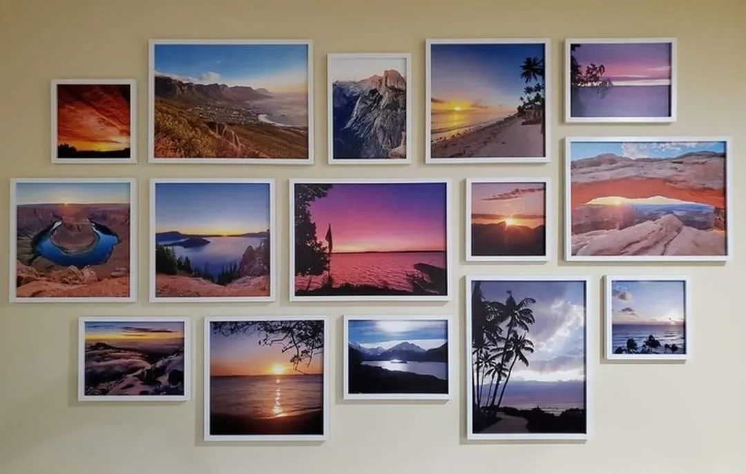
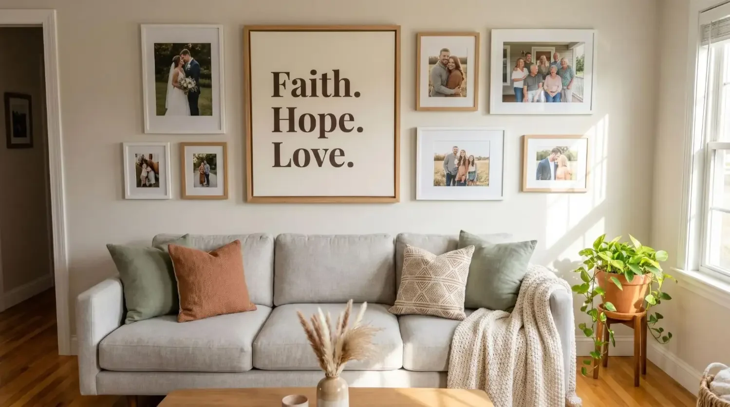
Start with the mood you want to create. Glossy works well with modern or high-contrast interiors, especially as a focal point. Scandinavian, Japandi, and transitional rooms pair nicely with matte or satin for a calm, cohesive feel. For mixed gallery walls with a wide range of photos, a matte finish helps unify different images and colors without visual noise.
Still undecided? Use this quick decision checklist

Choose matte if... Your wall gets bright light or overhead glare. Your image is a portrait, black and white, or features soft tones and fine details. You prefer a classic, non-reflective, museum-style look.

Choose glossy if...
You want maximum color pop and deep contrast. Your room has dim or controllable lighting. Your image is bold, saturated, or a night or city scene that benefits from a glossy finish.

Choose satin or semi-gloss if...
You want a versatile middle ground for mixed lighting and a wide range of photos and artwork. This finish provides balanced color and reduced glare without going full matte or full gloss.
How do matte vs glossy canvas prints compare to Mixtiles?
Mixtiles makes display simple. You get a refined, low-glare look, easy ordering, and no-fuss installation. If you like to move things around, Mixtiles are designed for you.
Effortless, low-glare look without the commitment
Mixtiles deliver a soft finish that looks great in bright or dim light. No glass, no heavy frames, and no complicated tools, just clean wall art that is easy to view and enjoy.
Repositionable and damage-free
Our tiles use peel-and-stick adhesive or a magnetic system. Place, straighten, and rehang without nails or holes. Perfect for renters, dorms, and redecorators who like to refresh layouts often.
From phone to wall in days
Upload your photos on the website or app, then select styles like Canvas Tiles or Gallery Wall Kits. Mixtiles ships worldwide with high-quality printing, so your wall art arrives ready to display.
Choosing between matte vs glossy canvas prints comes down to light, subject matter, and the atmosphere you want to create. Matte excels in bright spaces and for portraits or subtle fine art. Glossy shines in controlled lighting with colorful, high-contrast images. If you want a polished, low-glare aesthetic without tools or guesswork, Mixtiles helps you create beautiful, movable wall art in minutes.
Ready to decorate smarter? Create stunning gallery walls with your favorite photos. Our peel-and-stick tiles have a soft, gallery-worthy look. No nails, no damage, all wow.
Frequently Asked Questions
Which is better for canvas prints, matte or glossy?
Choose based on light and image style. Bright or windowed rooms favor matte, since it reduces glare and preserves detail. Dim or controlled lighting can benefit from glossy or semi-gloss, which deepen blacks and boost saturation for a punchier look.
For art prints on canvas, should I choose matte or glossy?
If the print is a portrait, black and white, or fine art with subtle gradients, pick matte for natural tones and easy viewing. Bold landscapes, sunsets, and high-contrast scenes often shine with glossy, especially when lighting is directed or dim.
Which finish looks more professional on canvas, matte or glossy?
Both can look professional. Galleries often lean matte or satin for a refined, museum feel with minimal reflections. Glossy reads modern and high impact, ideal as a focal point under controlled lighting. Match the finish to your decor and display conditions.
Do professionals prefer glossy or matte canvas prints?
Many photographers and designers choose matte or satin for exhibitions, because these finishes minimize glare and ensure consistent viewing from different angles. For commercial displays or high-contrast images, glossy is common, since it amplifies color and perceived depth under accent lighting.
Be the first to know — deals, news & decor ideas.
By clicking you agree to the Terms of Use & Privacy Policy