
Gold Abstract Wall Art: Transform Your Space Today
Key Takeaways
- Gold abstract wall art instantly adds warmth, luminosity, and a sense of luxury to any interior, from minimalist to maximalist spaces;
- Popular style combinations such as black and gold, white and gold, and blue and gold each create a distinct mood that suits different room personalities;
- Room placement matters: the right gold abstract piece can anchor a living room, soften a bedroom, or make a dramatic first impression in an entryway;
- With Mixtiles' adhesive, repositionable tiles, you can build and rearrange a gold-toned gallery wall without a single nail hole and update it as your style evolves.
There is something undeniably magnetic about gold abstract wall art. Whether it is a fluid pour of champagne and ivory, a dramatic black-and-gold composition, or a shimmering geometric print, gold-toned artwork has a unique ability to transform blank walls into something that feels curated, warm, and alive. If you are looking for ideas to bring more richness into your home décor, this guide covers the best styles, color pairings, room placements, and practical tips for displaying gold abstract art with confidence.
Ready to bring golden warmth to your walls? Browse Mixtiles' custom canvas prints and start building your perfect display today. Whether you want small accents or large 20x20 canvas prints, you can decorate with no nails, no commitment, and no stress.
Why Is Gold Abstract Wall Art So Universally Appealing?
Gold has carried associations with warmth, abundance, and light for centuries, and those qualities translate directly into modern home decor. When you hang gold abstract canvas pictures, you are not just adding color to a room. You are introducing a surface that interacts with light in a way few other tones can match.
Abstract art, in this context, refers to non-representational compositions: works that use form, texture, brushstroke, and color to evoke emotion rather than depict a recognizable subject. If you want to deepen your understanding of the genre before choosing a piece, our guide to what abstract art is covers the history, key characteristics, and major movements in an accessible way. That open-ended quality makes gold abstract art especially accessible. It does not demand a specific taste or a particular decorating style to feel right. A fluid gold pour painting can look equally at home in a sleek modern living room and a warm, layered bedroom.
What makes gold on canvas particularly special is its shifting quality throughout the day. Morning light picks up the warmer, amber notes in a gold abstract canvas art piece, while evening lamplight deepens the same tones toward something richer and moodier. That live quality gives gold abstract art a presence that flat, single-tone prints simply cannot replicate.
What Are the Most Popular Gold Abstract Wall Art Styles?
Gold abstract art is not one single look. It spans a wide spectrum of color pairings, textures, and moods. Understanding the main style families helps you choose pieces that genuinely fit your space and personality rather than simply picking what looks good in a product photo.
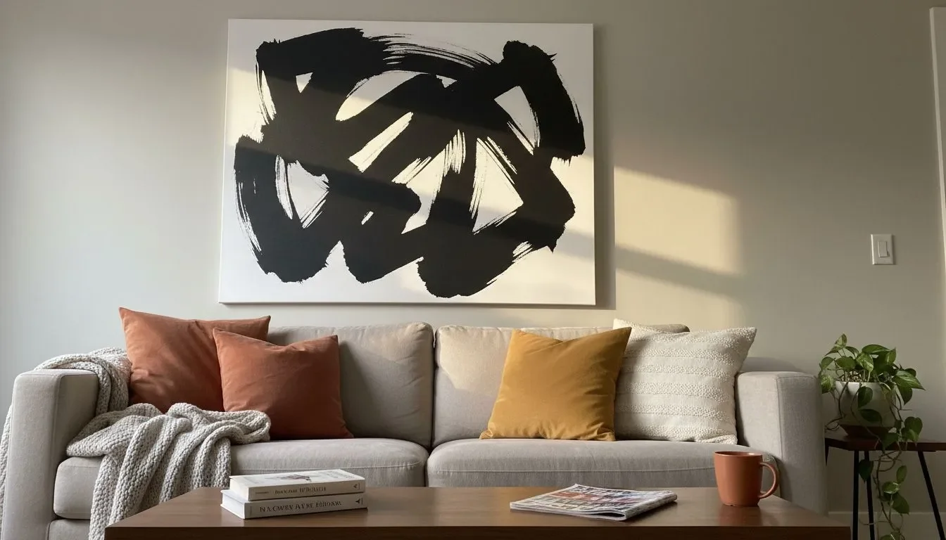
Black and Gold Abstract: Bold, Dramatic, and Timeless
Few combinations hit harder than black and gold. In this pairing, deep black grounds the composition and gives the gold tones a surface to pop against, creating a high-contrast graphic energy that feels both contemporary and Art Deco in spirit. Black and gold abstract wall art works exceptionally well as a statement piece in a living room or entryway, where it commands attention without needing additional decoration around it. If your space features dark marble, matte black metal fixtures, or charcoal walls, a black and gold abstract canvas will feel completely at home.
Gold and White Abstract: Airy, Elegant, and Versatile
White and gold is the most quietly sophisticated pairing in the gold abstract family. A white background amplifies every gold accent, giving pieces a luminous, gallery-worthy quality that feels both modern and timeless. This combination offers warmth without heaviness, making it ideal for spaces that benefit from a light touch of luxury. Gold and white abstract wall art layers beautifully into bedrooms, dining rooms, and transitional interiors where you want elegance without visual noise. It is also one of the most reliable choices if you are decorating a rental or a space that changes purpose over time.
Blue and Gold Abstract: Rich, Vibrant, and Eye-Catching
The pairing of deep navy or teal with gold has a long art history, most famously in the gilded, jewel-toned canvases of Gustav Klimt. In contemporary blue and gold abstract art, that same dynamic tension plays out in fluid pours, geometric forms, and swirling brushwork. The result is artwork that feels both luxurious and energetic. Blue and gold abstract canvas pieces work especially well in home offices, living rooms, and spaces where you want art that genuinely commands the eye. The contrast between cool blue tones and warm gold creates a natural focal point on any wall.
Champagne, Rose Gold, and Neutral Tones: Soft and Romantic
At the softer end of the gold spectrum, champagne, rose gold, ivory, and earthy amber tones bring a different kind of warmth. These muted, textured gold abstract paintings sit within the growing Wabi-Sabi aesthetic trend: imperfect, organic compositions that celebrate natural materials and quiet beauty. If bold metallics feel too intense for a bedroom or reading nook, this is the direction to explore. Pale gold on beige, blush pink on cream, or rose gold on warm white creates an atmosphere that is both refined and genuinely restful.
Which Room Gets the Most Out of Gold Abstract Wall Art?
Gold abstract art is one of the most versatile categories in modern wall decor. It works across virtually every room in the house, though the right style and scale will shift depending on the space. Here is how to think about placement room by room.
Living Room: The Statement Focal Point

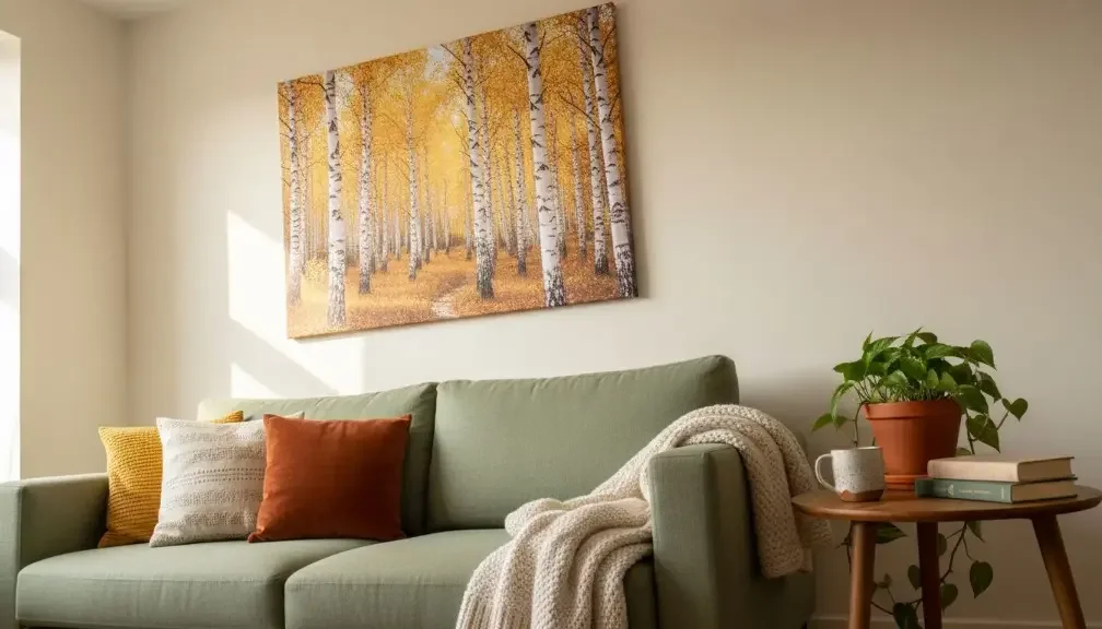
The living room is where gold abstract wall art performs at its best. A large gold canvas above the sofa or fireplace creates an immediate warm, luminous anchor for the entire space. Pair it with metallic accessories, warm-toned textiles, and soft lighting to let the golden tones do their full work. For a broader look at how to style this space with artwork, our dedicated guide to abstract living room wall art offers layout inspiration and pairing ideas worth exploring. On a dark or neutral wall, a large gold abstract piece draws the eye naturally and gives the room the kind of curated, gallery-quality presence that feels effortlessly elevated.
Bedroom: Understated Luxury Above the Headboard

Above the headboard is one of the most impactful positions for gold and white or champagne abstract art. The soft tones add glamour without overpowering the restful atmosphere a bedroom needs. Choose pieces with gentle texture and muted gold accents rather than high-contrast compositions to keep the mood calm. Warm bedside lighting will further enhance the metallic quality of the artwork, making it look different and equally beautiful whether the morning sun is streaming in or your evening lamps are on.
Entryway and Hallway: A Golden First Impression

A single dramatic gold abstract piece in an entryway sets the tone for everything that follows. For a spacious entry, a large-format canvas or a trio of coordinating gold abstract art prints creates a polished, gallery-like arrival moment. For a narrower hallway, one well-chosen piece in a slim vertical format does the job without crowding the space. Either way, the metallic quality of gold art catches the eye immediately as guests walk in, making a lasting impression with minimal effort.
Dining Room: Warmth Around the Table

Gold abstract wall art thrives in dining rooms, where candlelight and overhead pendant fixtures amplify its metallic sheen during evening meals. A horizontal composition above a sideboard or buffet adds warmth at eye level without competing with the table setting. Gold and white abstract art pieces work particularly well here, as they brighten the room during the day and take on a richer glow by night. The dining room is also an excellent space to introduce larger, more textured abstract gold painting styles that would feel too intense in a bedroom.
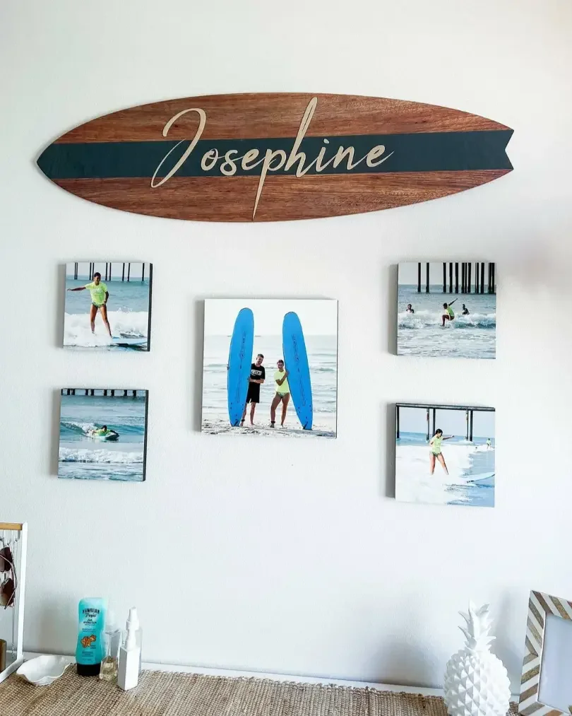
Love the idea of a golden photo gallery wall but not sure where to start? Mixtiles' repositionable frames make it simple to experiment with layouts. Move them around until the arrangement feels exactly right, with no damage to your walls.
How Do You Style Gold Abstract Wall Art Like a Pro?
Getting the most out of gold abstract art is less about following strict rules and more about understanding a few principles that professional interior designers rely on consistently. These practical tips will help you style your pieces with confidence, whether you are hanging a single canvas or building a full gallery wall.
Here are the key principles to keep in mind when styling gold abstract wall art in your home:
- Layer metallic finishes by mixing brushed gold, champagne, and antique brass tones for visual depth rather than relying on one uniform metallic throughout the room;
- Pair gold art with complementary materials such as dark marble, walnut wood, velvet upholstery, and mirrored surfaces, all of which amplify the richness of gold abstract pieces;
- Consider scale carefully: a large oversized canvas works as a solo focal point, while smaller gold abstract art prints are more impactful when grouped into a cohesive arrangement;
- Use lighting strategically, since natural daylight enhances the metallic luster of gold art and warm-toned accent lighting creates dramatic depth in the artwork during the evening hours;
- Choose the right wall color, as gold abstract art sings against deep charcoal, navy, warm white, and greige walls but can feel flat against bright white or cool grey surfaces.
How Do You Build a Gold Abstract Gallery Wall at Home?
A gold abstract gallery wall brings together curated art prints and personal photos into a single, cohesive display that feels both polished and personal. The concept works particularly well when you mix golden-toned abstract canvas art with your own warm-toned photos: golden-hour travel shots, sunset portraits, or any image with amber and ivory light will echo the gold palette beautifully and make the wall feel like it was designed with intention.
The practical advantage of building your gallery wall with Mixtiles tiles is significant. The adhesive, repositionable backing means you can experiment with your layout freely, shifting tiles around until the arrangement feels right, with no nail holes and no permanent commitment. Mixtiles canvas prints and photo tiles are available in a range of sizes that work naturally together in gallery wall compositions:
|
Mixtiles Tile Size |
Dimensions (cm) |
Best Use in a Gold Abstract Gallery Wall |
|---|---|---|
|
21.35 x 21.35 cm |
Accent tiles; ideal for mixing with larger statement pieces |
|
|
31.6 x 31.6 cm |
Versatile mid-size tiles; the natural building block of most gallery walls |
|
|
12" x 16" |
31.6 x 41.75 cm |
Portrait-format tiles; great for adding vertical rhythm and visual variety |
|
20" x 20" |
49.53 x 49.53 cm |
Large focal point tiles; best used as the centerpiece of a broader arrangement |
For layout approach, a clean grid works well for a modern or minimalist interior. A salon-style arrangement with varied sizes and orientations suits a more eclectic, maximalist space. A single horizontal row reads beautifully in narrow hallways. If you want practical guidance on composing your display before you start placing tiles, our roundup of wall art arrangement ideas walks through the most effective configurations for different wall shapes and room sizes. When choosing frame styles for your Mixtiles tiles, natural wood, black, and white frames all complement gold abstract palettes without competing with the artwork itself.
Gold abstract wall art has earned its place as one of the most enduring and versatile choices in contemporary home decor, and for good reason. From the sharp drama of black and gold abstract compositions to the quiet romance of champagne and rose gold pairings, there is a style in this family that works for every personality and every room. The key is to start somewhere, to choose a piece that genuinely moves you, place it where it catches the light, and let it do its work.
You do not need to have everything figured out before you begin. The beauty of decorating with gold abstract art is that it evolves with your space. Add a piece above the headboard today. Build a gallery wall in the living room next month. Swap in new Mixtiles tiles when a fresh golden-hour photo from a recent trip deserves a spot on the wall. The best gallery wall is always the one that keeps growing.
Turn your golden vision into reality. Create your own personalized display with our stylish photo tiles. Choose your photos, pick your layout, and let your walls do the talking. Start designing today.
Frequently Asked Questions
Is gold abstract wall art still in style?
Gold abstract wall art has remained a consistent presence in contemporary interior design and shows no signs of fading. Its versatility across decorating styles, from minimalist to maximalist, and its ability to introduce warmth and light to any room keep it relevant well beyond seasonal trends.
What makes gold wall art so appealing?
Gold interacts with light in a way few other tones can match, shifting from warm amber in morning light to rich, moody depth under evening lamps. Combined with abstract composition, which evokes emotion rather than depicting a subject, gold abstract art feels both personal and universally elegant.
What is the two-thirds rule when hanging wall art?
The two-thirds rule suggests that a piece of wall art should span roughly two-thirds the width of the furniture below it, such as a sofa or sideboard. This proportion creates visual balance and ensures the artwork feels anchored to the space rather than floating or overwhelming the room.
Be the first to know — deals, news & decor ideas.
By clicking you agree to the Terms of Use & Privacy Policy